PICNIC – Identity, retail design and packaging
Fresh look for a new brand position
The business target
With around 40 locations across Finland, Picnic is the go-to restaurant chain for quick meals and favourite cafeteria products. They were embarking on a fundamental strategic repositioning with the focus on good-conscience fast food. However, Picnic’s old brand identity and interior concept told a different story. They invited Kuudes to perform a major overhaul of the Picnic look in order to freshen the image customers have about the brand.


Our solution
Fresh ingredients first
To communicate the freshness of Picnic products, we let their ingredients take center stage. Boxes of potatoes and bowls of lettuce are not hidden behind the counter – instead, they are proudly presented, visible to the customer. We also created a pattern with organic shapes, inspired by Picnic products and ingredients like baguettes, apples and tomatoes. The illustrations are used everywhere from restaurant walls to take away packaging to create a consistent look.


photo credit: Tomevski & Co
Eat your colours
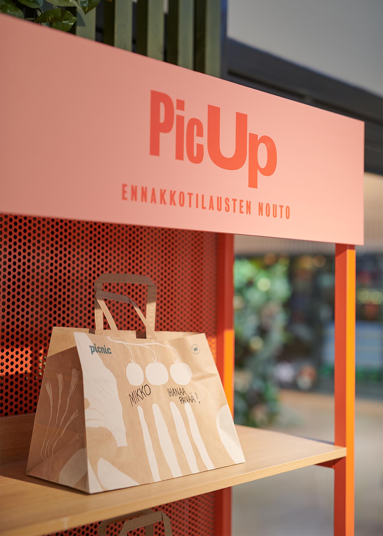
Colours play a crucial role in the new customer experience. The natural and organic palette embodies the energy and freshness of Picnic ingredients. But it has a highly functional purpose too. The bright brick red guides the customer to the fast lane with take-away options, self-service, and the ‘PicUp’ station for pre-orders.
The refreshed look is especially important when innovating new products suitable for the rise in takeaway dining. With clearly marked taste options and upgraded usability, the packaging is now not only inviting to the eye and taste buds but also convenient in its grab-and-go nature. The proudly biodegradable packaging range makes sure you can enjoy your meal with a clear conscience, for yourself and the planet.


Results
“Working with Kuudes is always a pleasure. Their approach is systemic and pragmatic, always keeping both consumer insight and business objectives in mind. As the scope of transformation is so wide in this case, Kuudes was able to utilize their capabilities to the fullest. This gave a special flavor to the collaboration as we had the opportunity to cover all consumer touchpoints. The end result is on strategy, distinctive and interesting. We continue being very satisfied with collaborating with Kuudes and the talents working there.”
– Petteri Laurikainen, Picnic CEO
For more information:
Jari Danielsson
CEO, Kuudes Nordic
jari.danielsson@kuudes.com
+358 40 730 9612
Interior images by Henri Vogt.
Packaging images by Tomas Olsen of Studio Fotonokka.


