Why physical retail matters?
Always in vogue
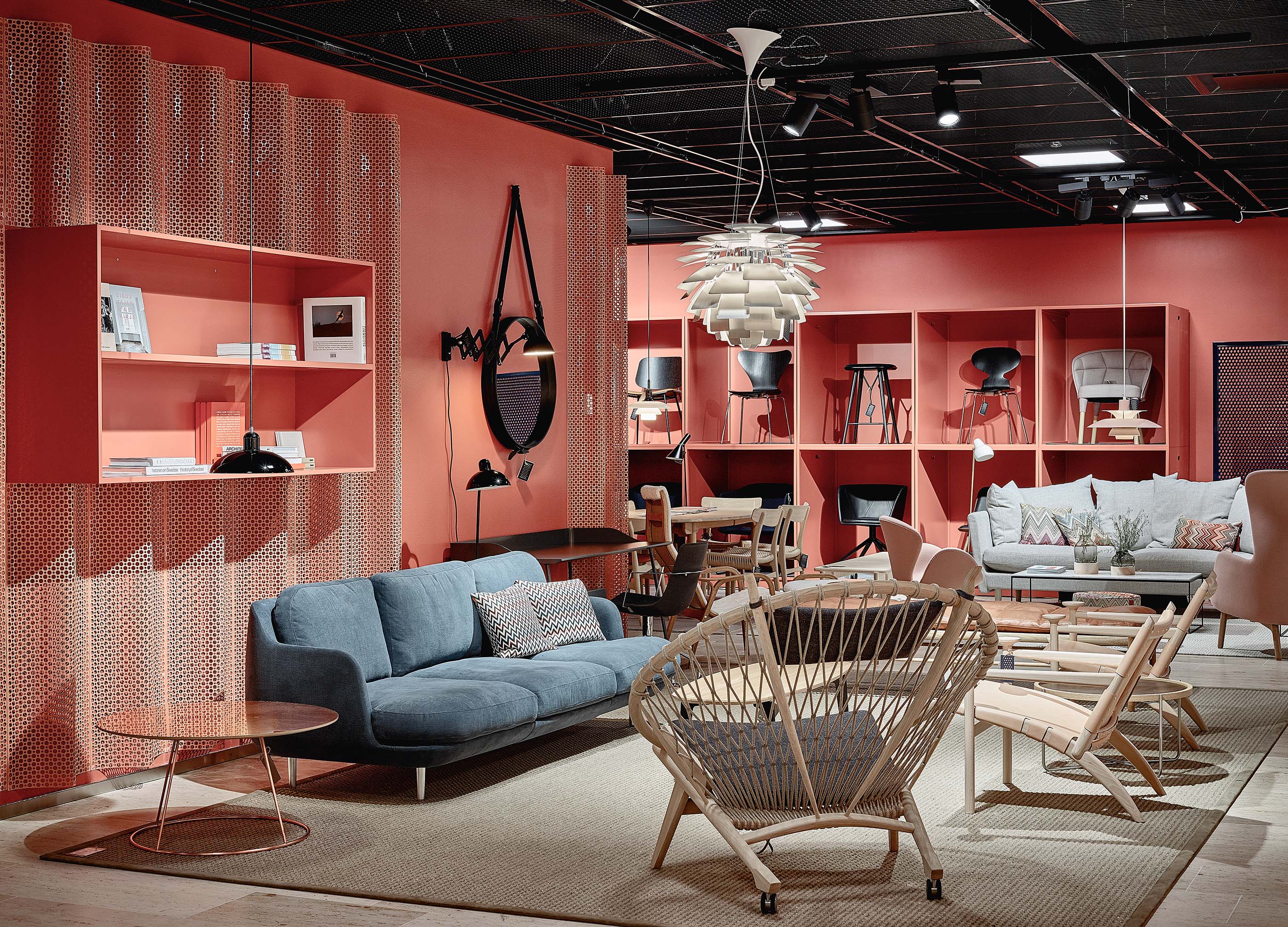
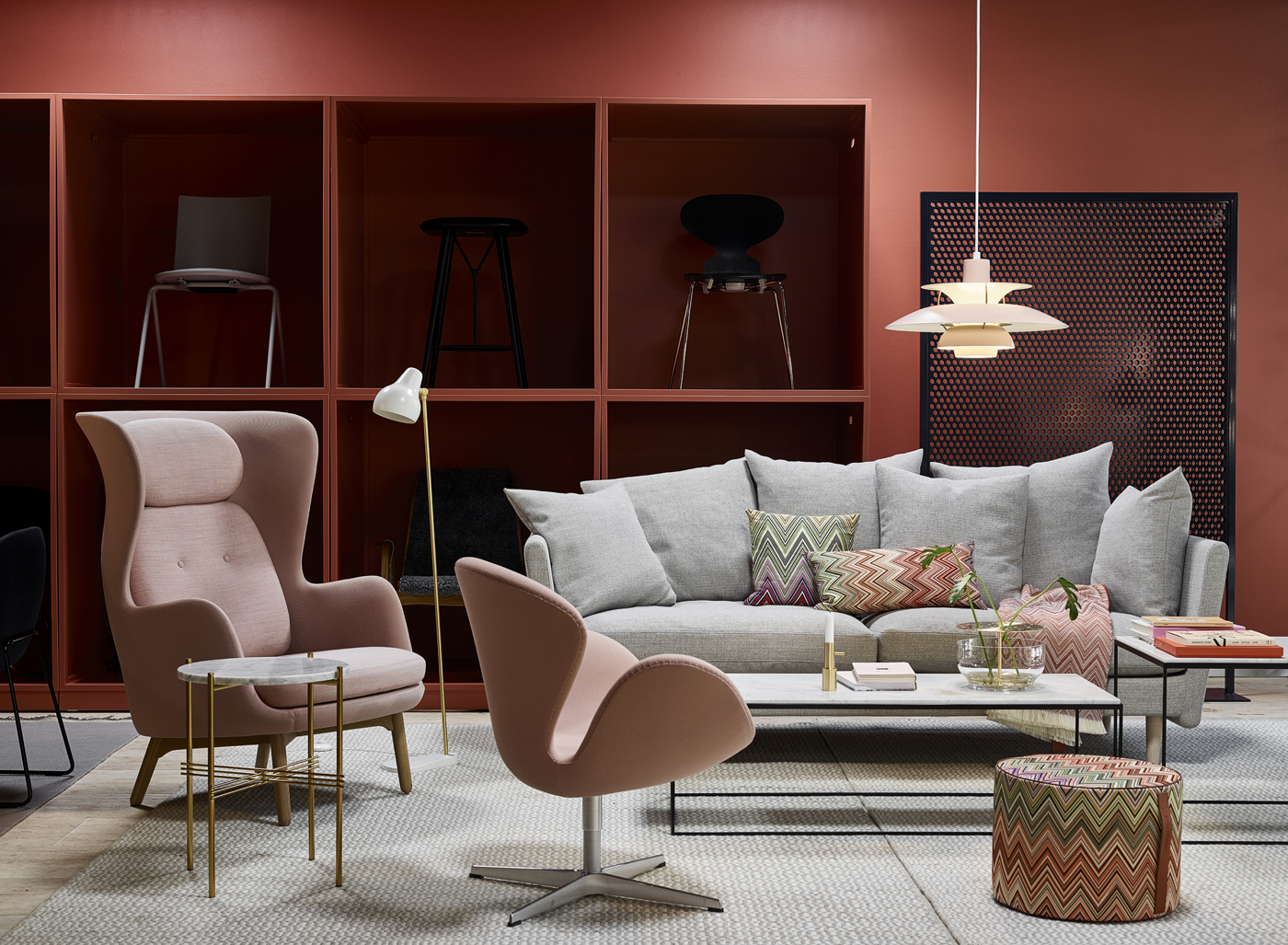
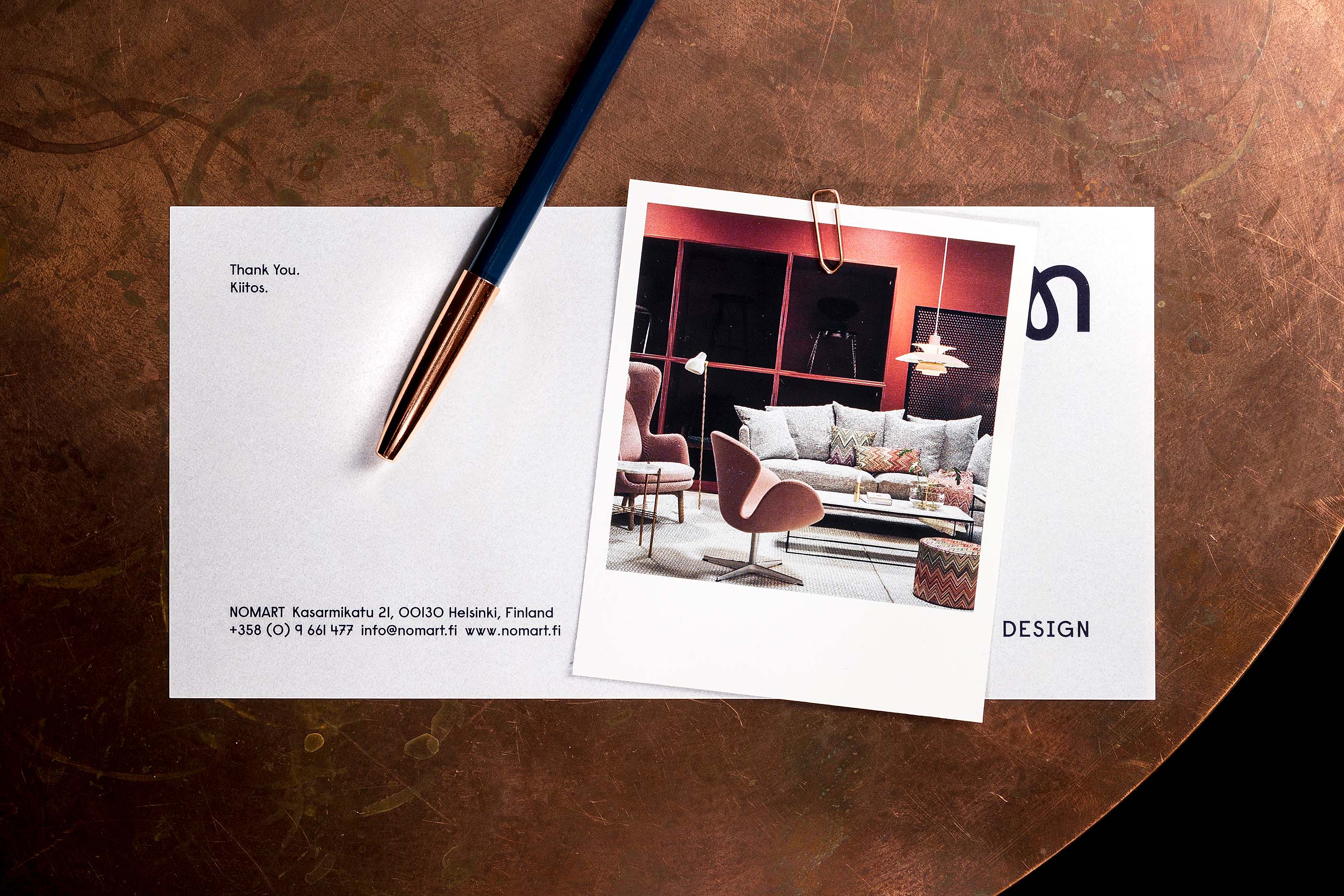
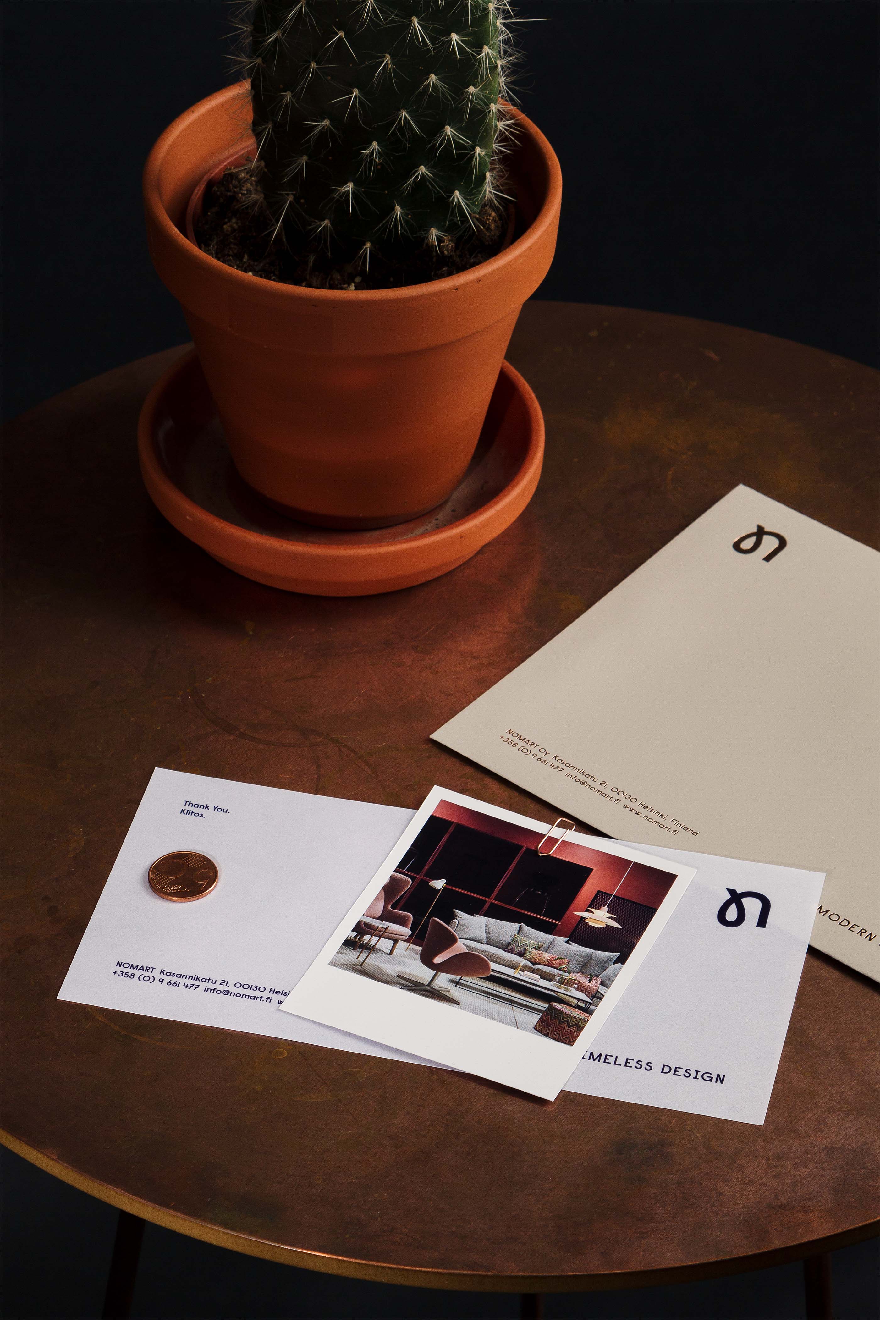
NOMART boasts some of the most prestigious Scandinavian and Italian design brands with high-quality furniture and homeware. They had a solid record on B2B sales, but chose to also broaden their range to consumer clients. Kuudes was given the task to redo their visual identity and design the brand-new retail space NOMART was about to open.
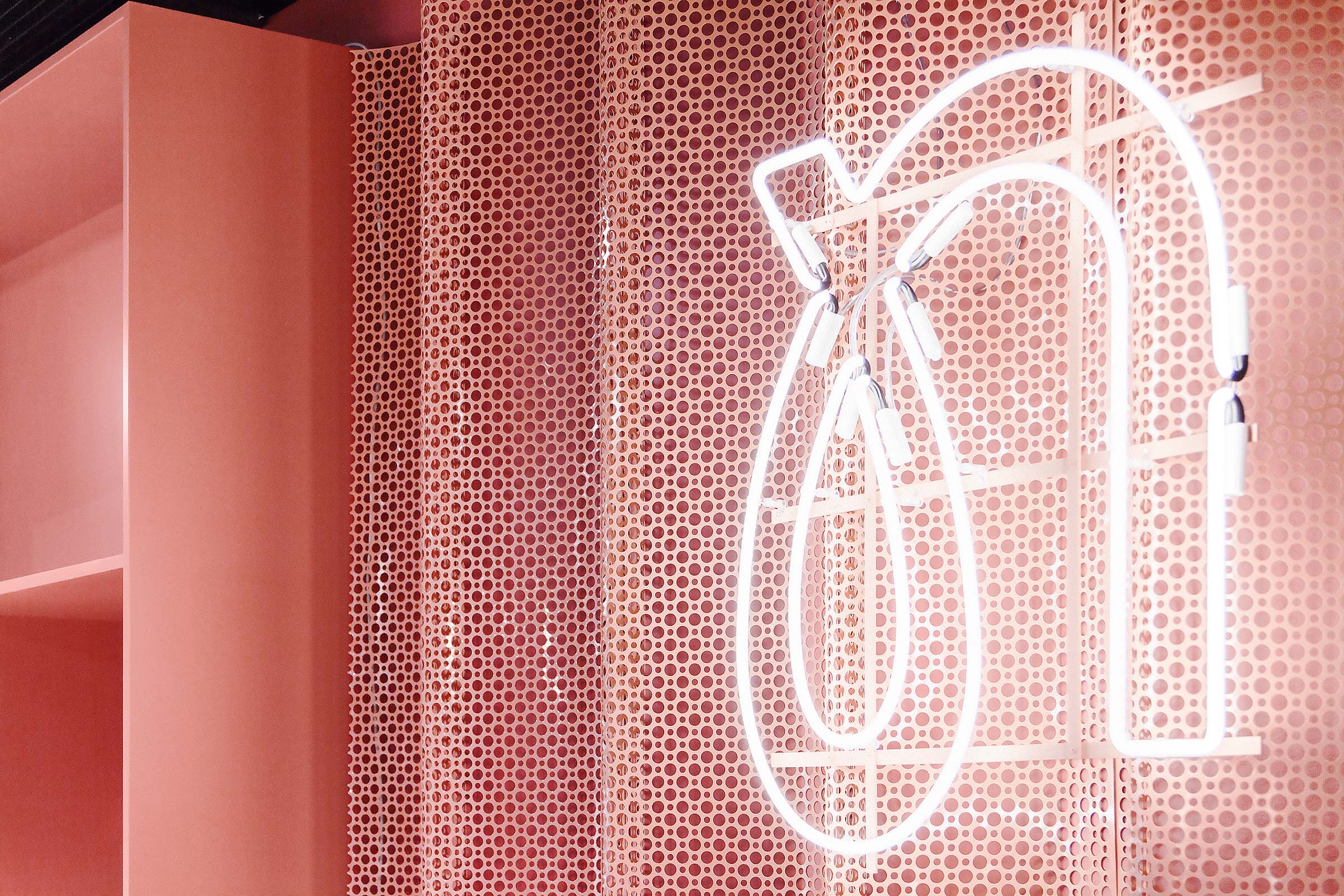
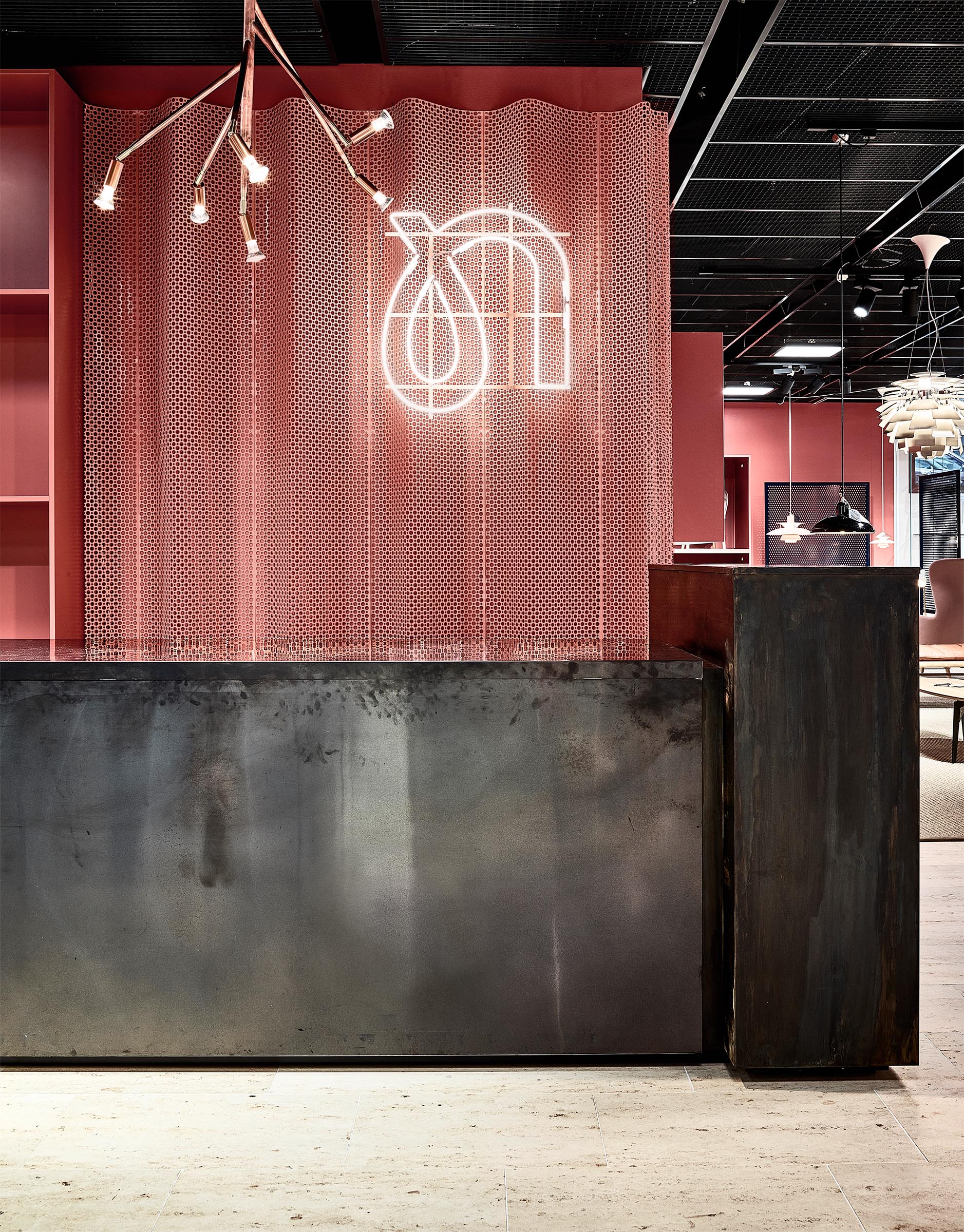
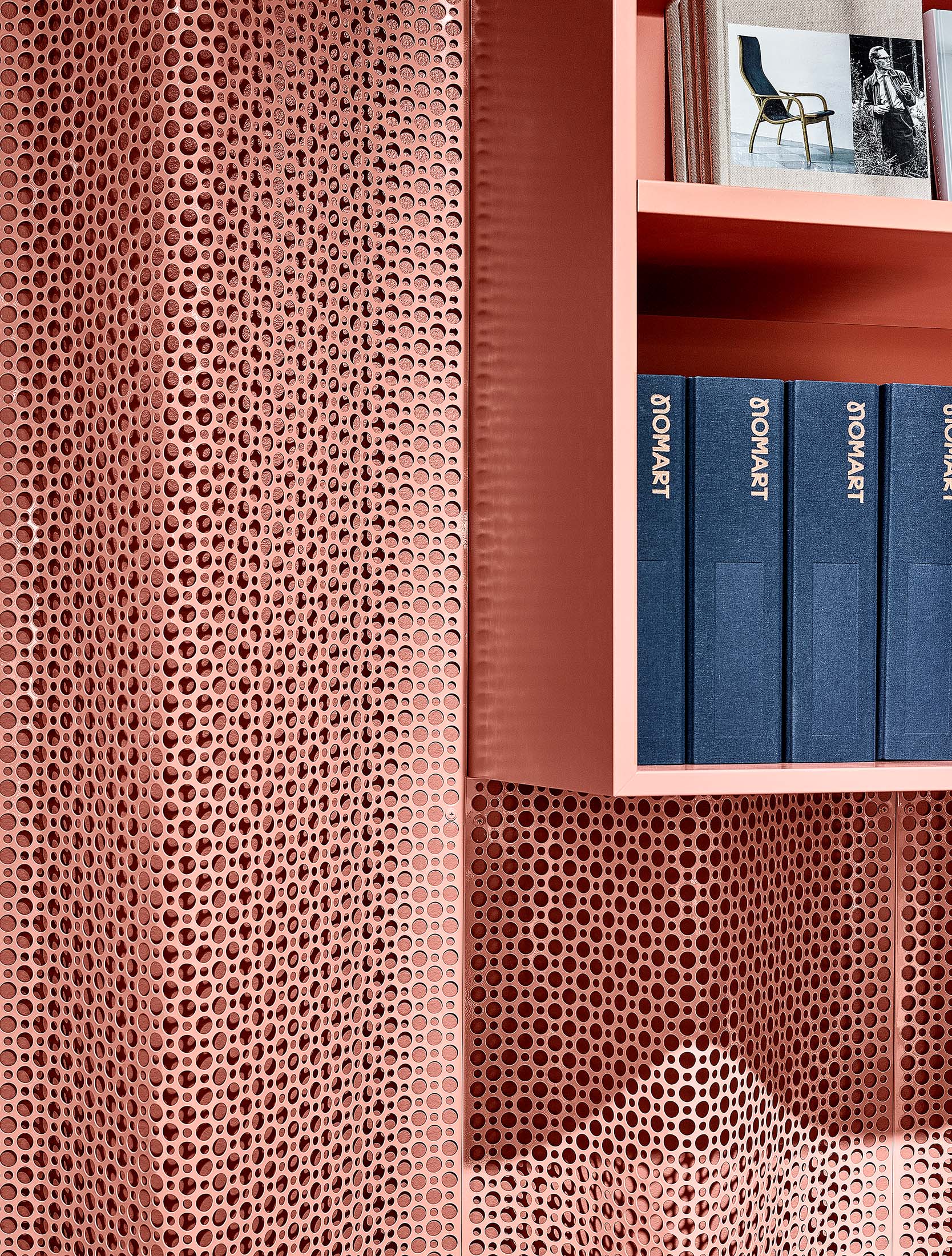
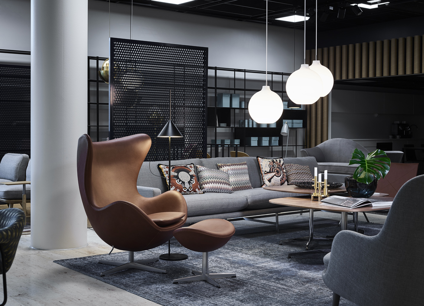
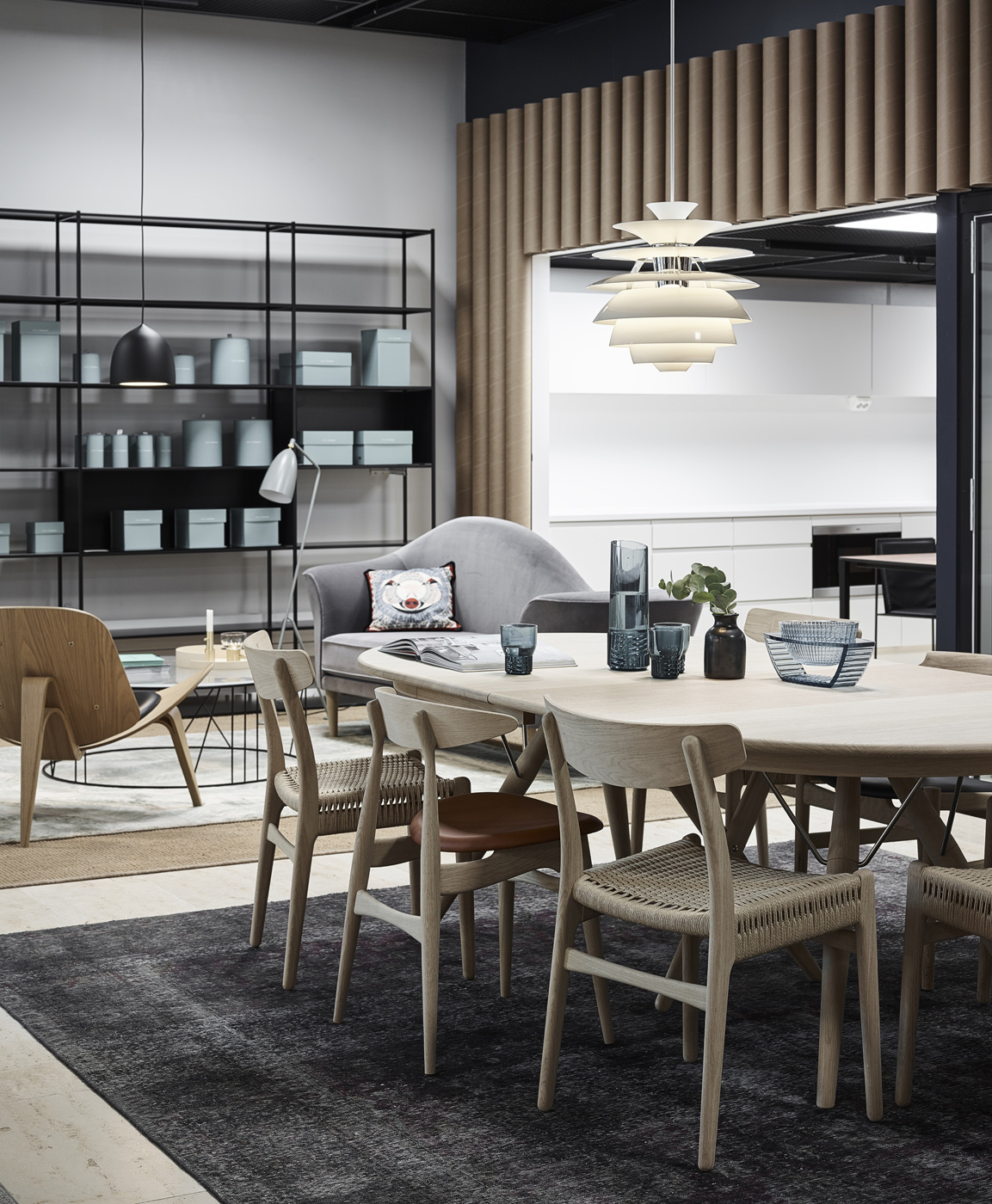
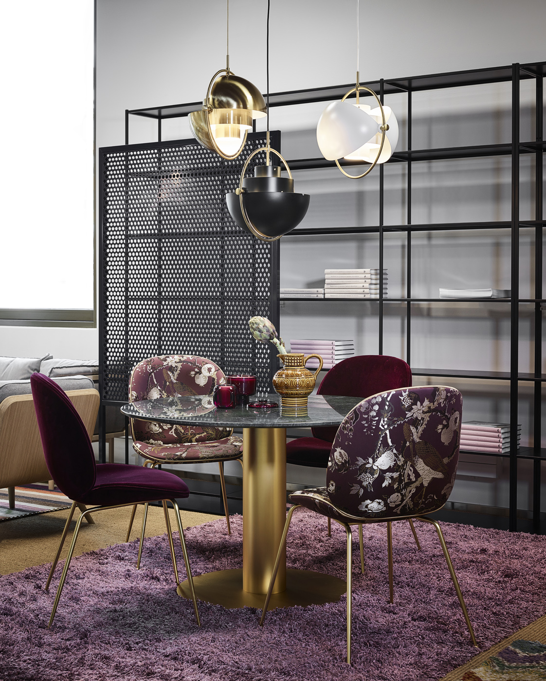
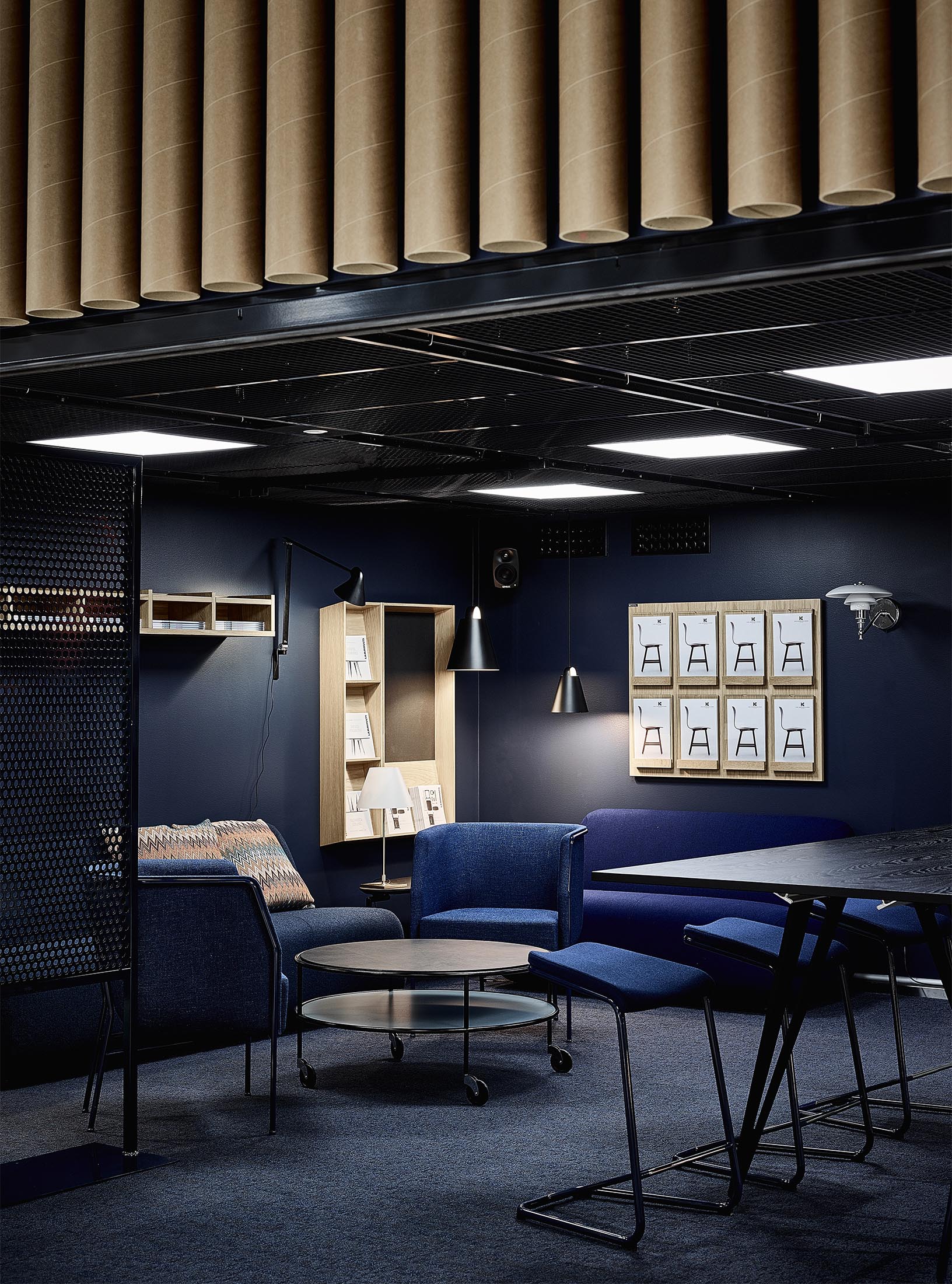
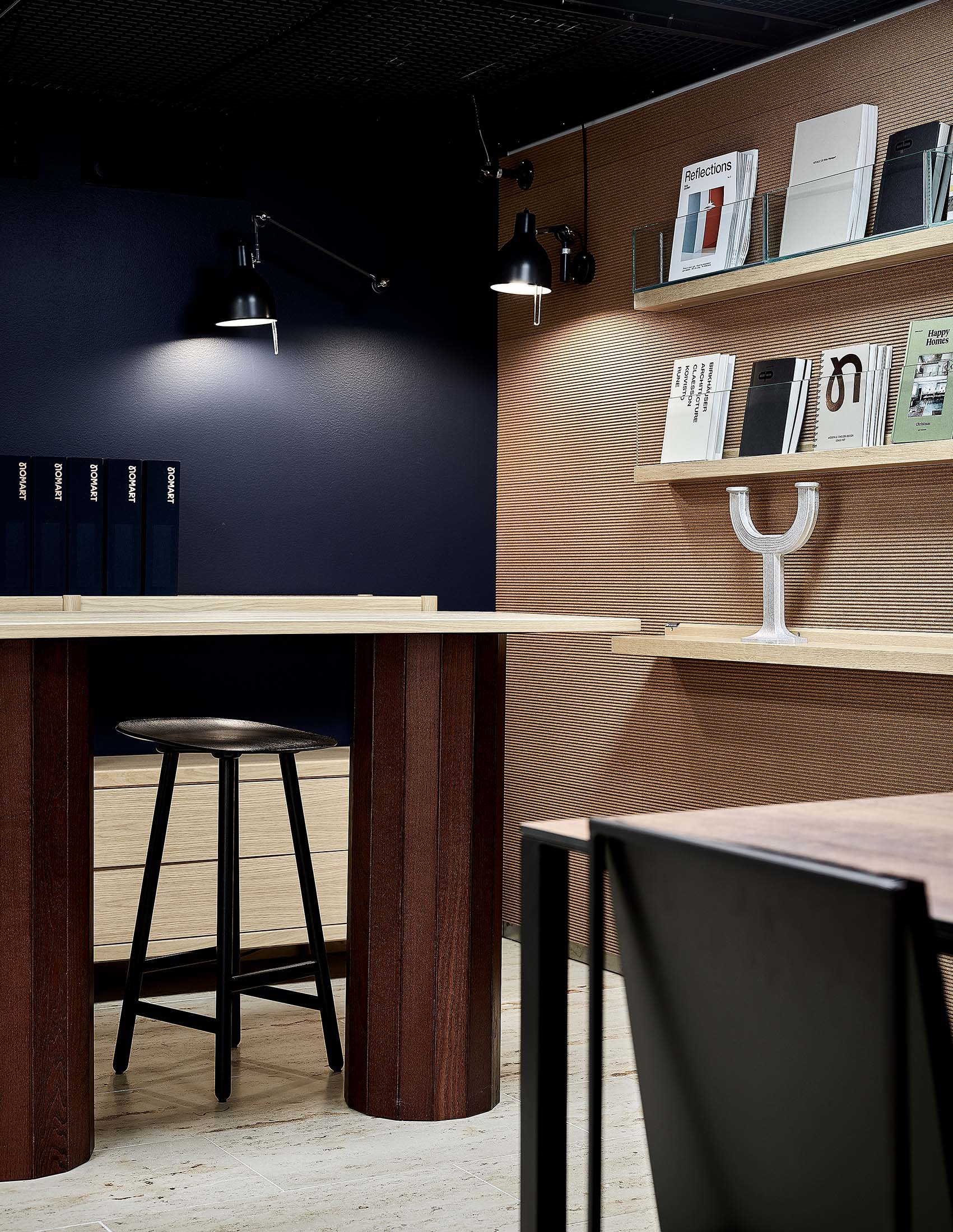
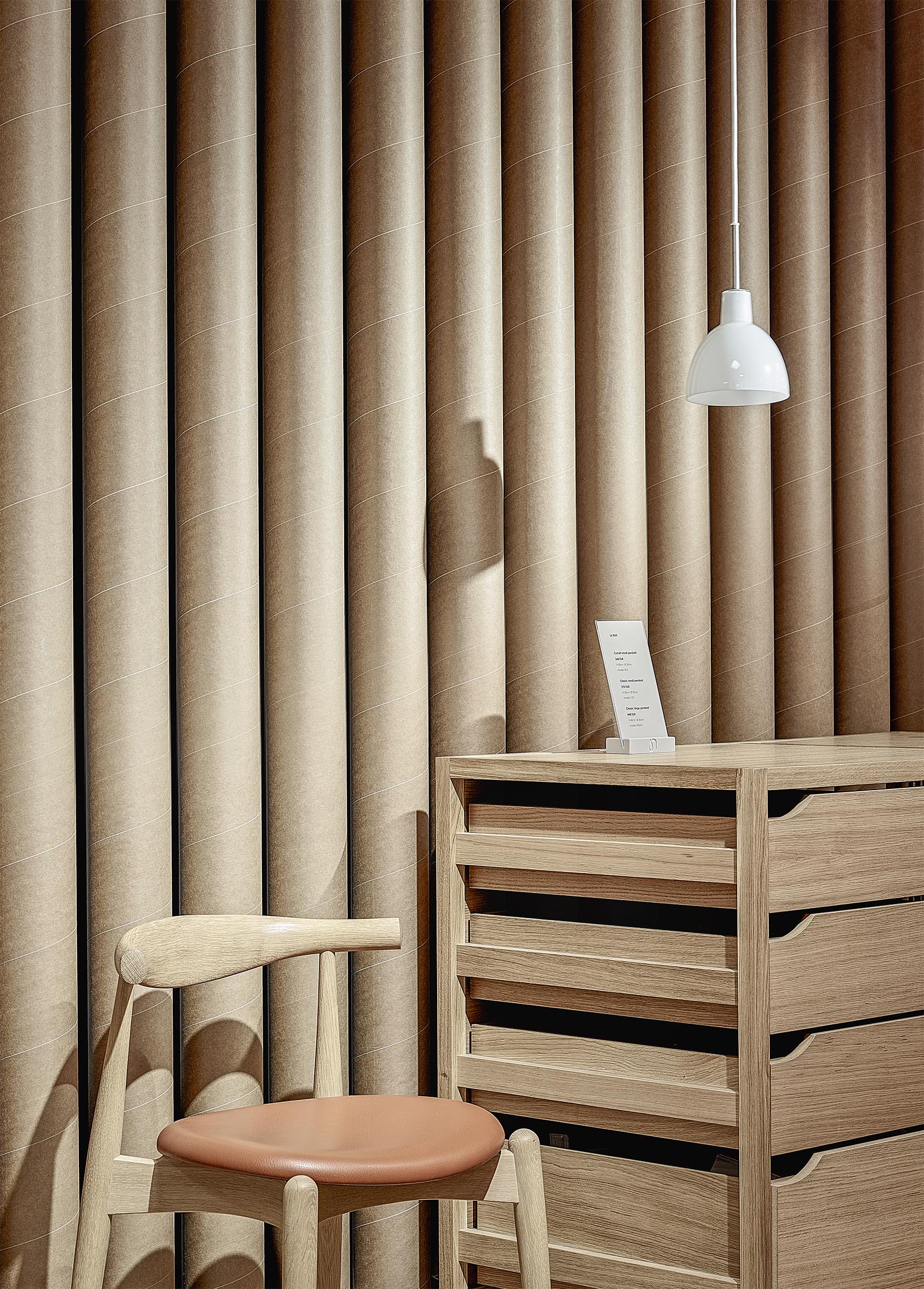
Our aim was clear: to create an inspiring retail space that would allow the furniture to stand out in a new way. Even though the products play the leading role, the space itself is anything but boring: the chosen colours and materials give an edgy feel to the otherwise cosy and welcoming space. By using natural shapes and materials, the design speaks the same language as the iconic furniture.
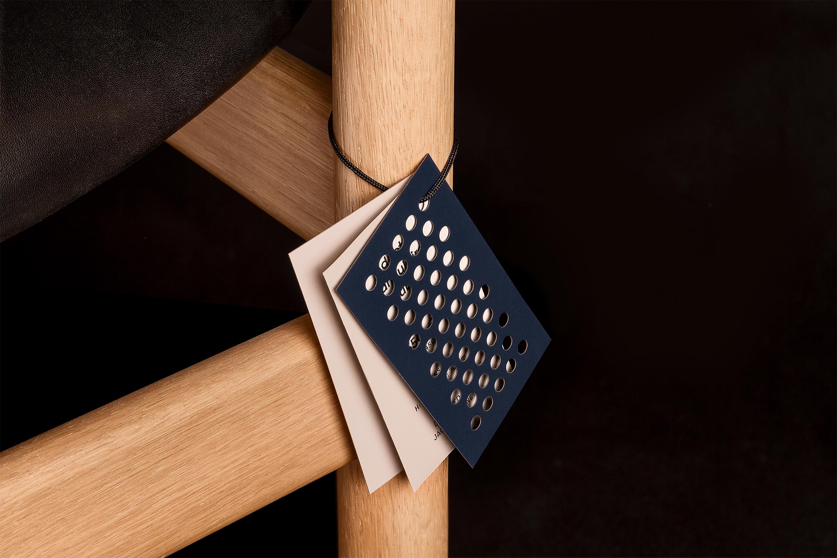
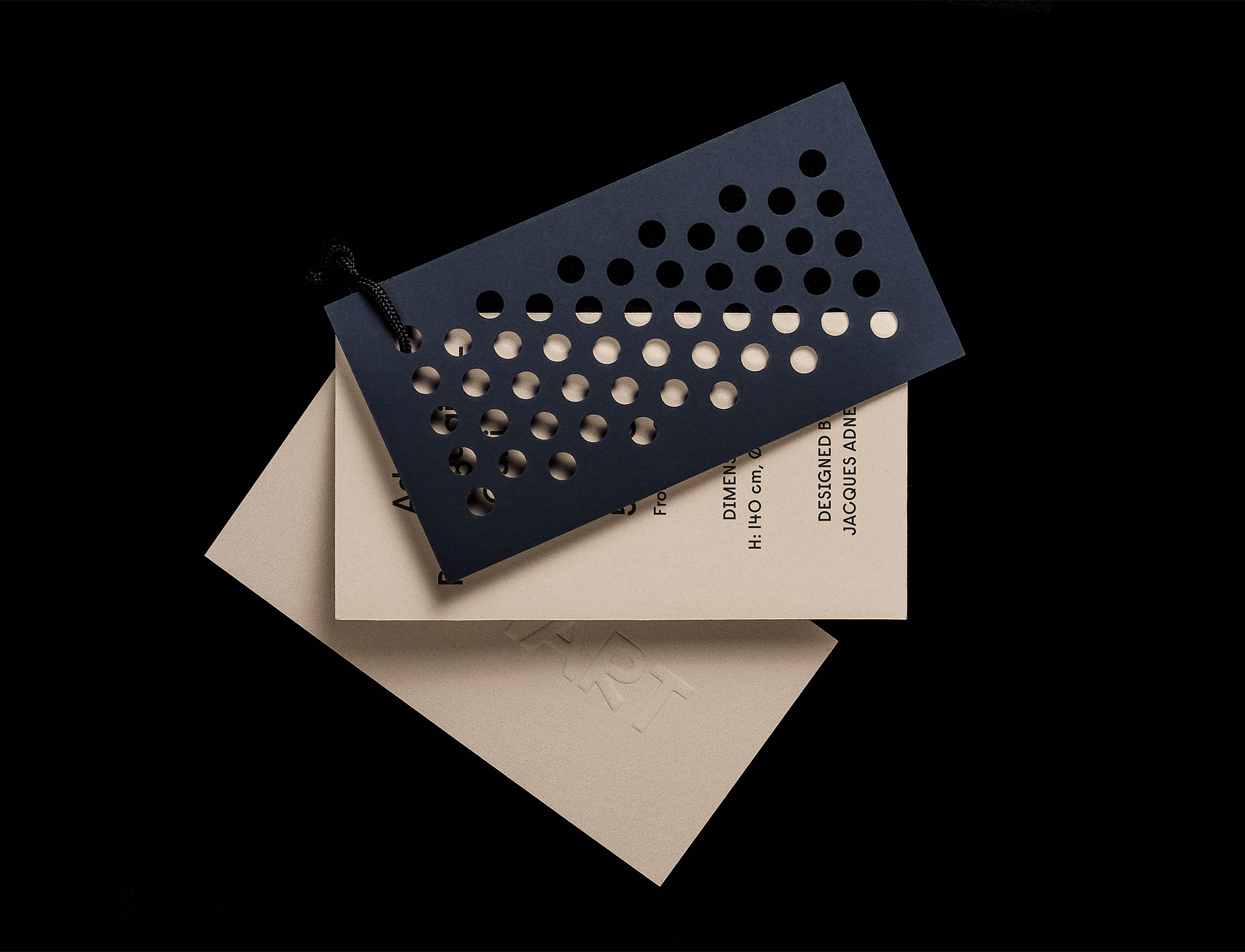
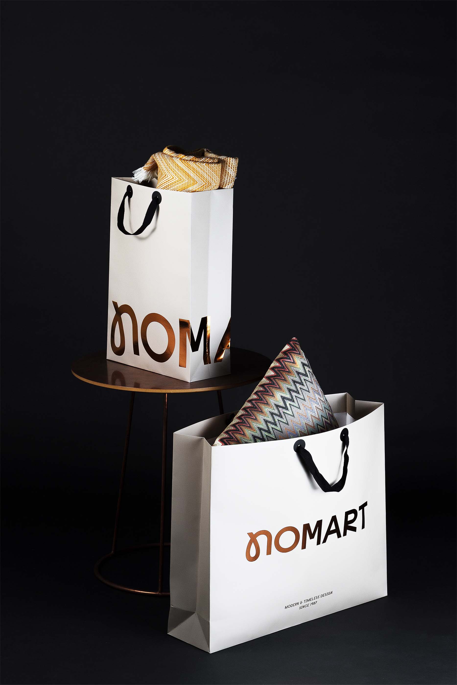
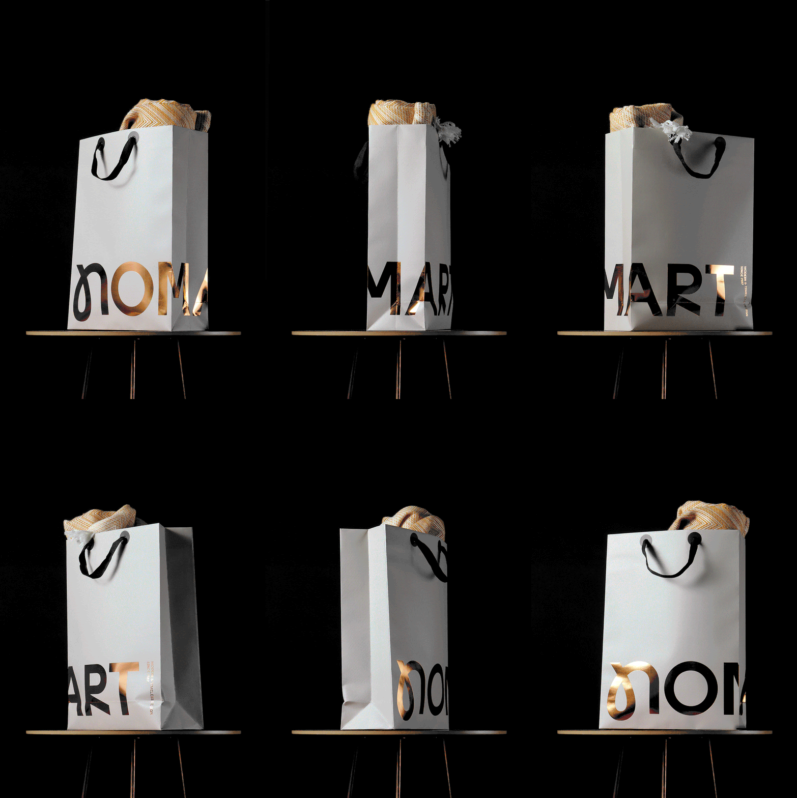
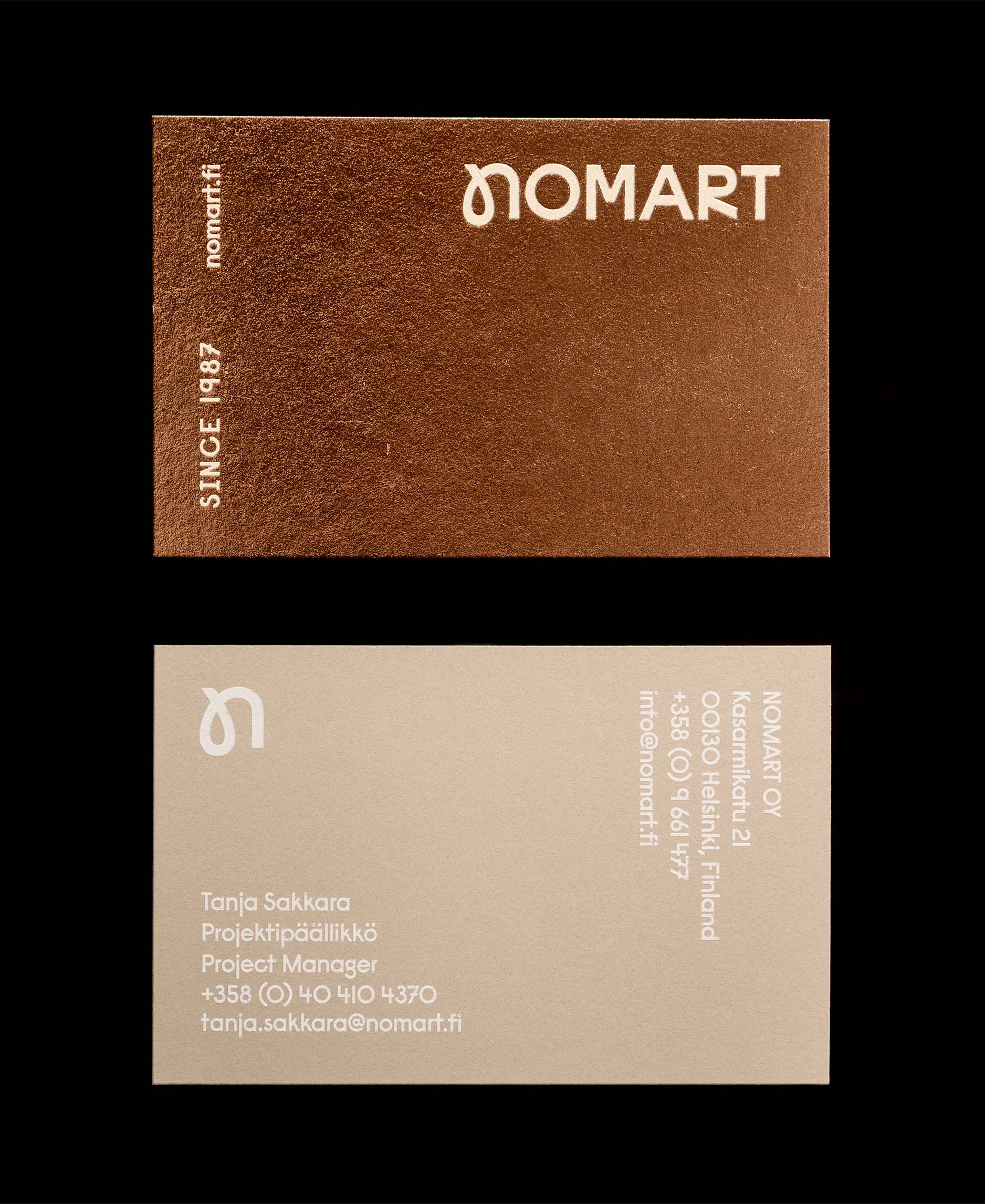
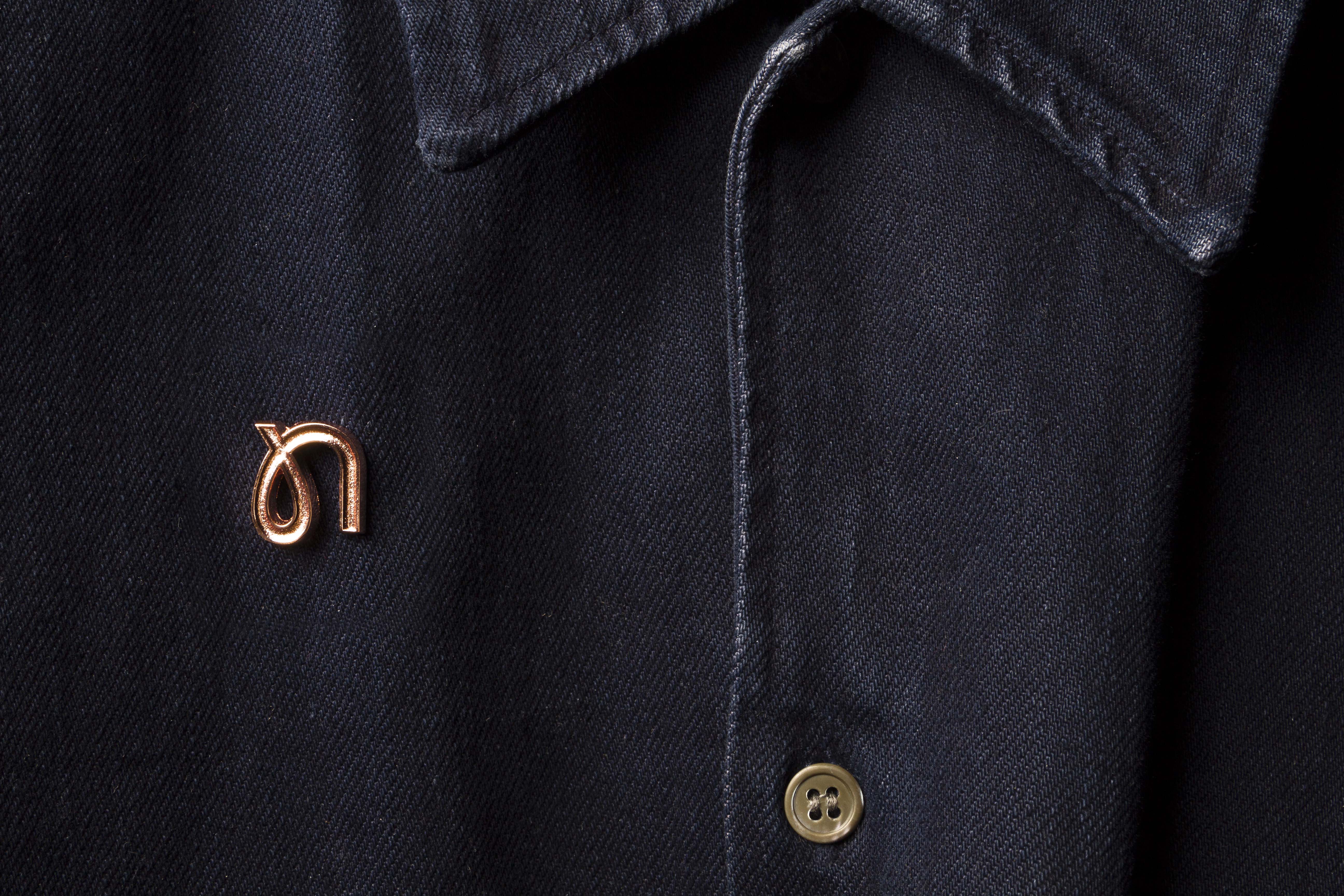
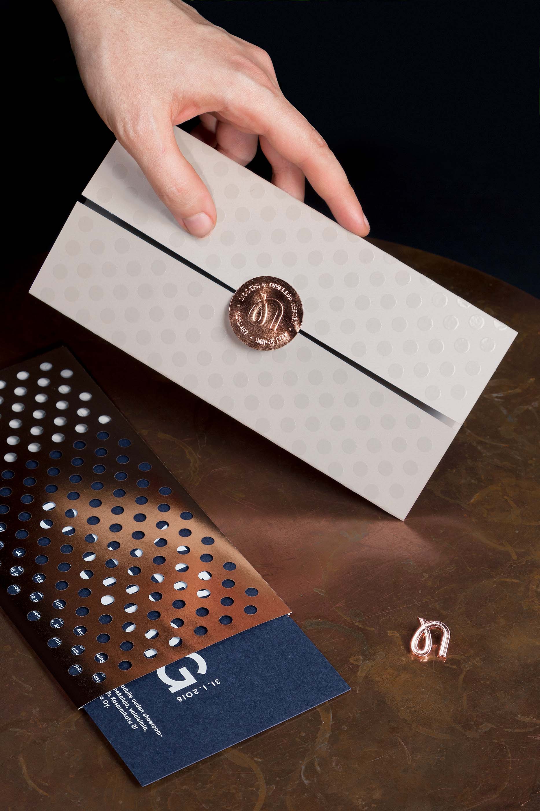
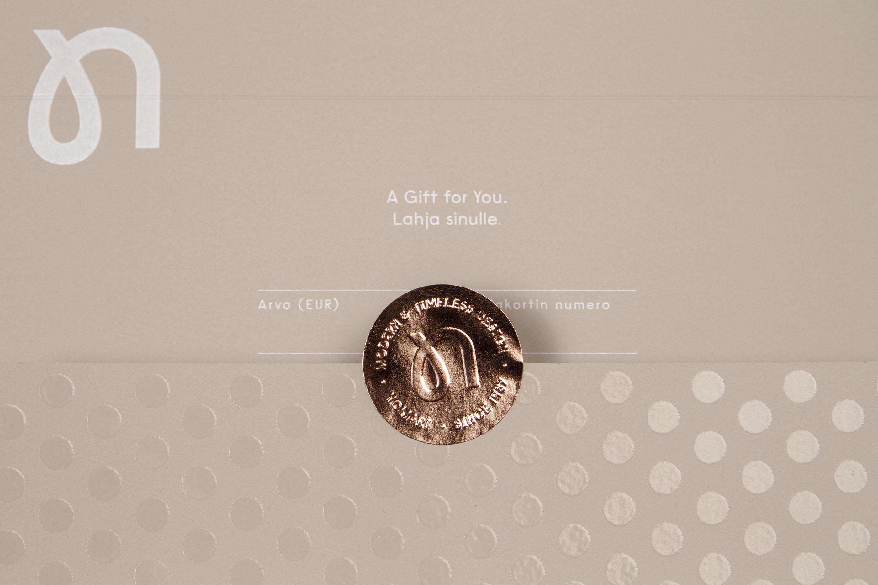
The new logotype is a subtle nod to the mid-century modern – the era when Scandinavian design was at its most influential. The royal navy-blue plays in perfect harmony with copper and warm beige – an ageless ensemble.

For more information:
Jari Danielsson
CEO, Kuudes Nordic
jari.danielsson@kuudes.com
+358 40 730 9612


