
OmaSp – Brand identity, applications, illustrations, brand images
Your local bank wherever you are
As OmaSp entered a new phase of sustainable growth, it needed an identity that could grow with it and stand apart in a financial category where brands often look and feel alike.
Kuudes partnered with OmaSp to sharpen its brand positioning and build a distinctive visual and verbal identity around what has always set the bank apart: a genuinely personal approach to banking and a strong connection to its customers and the communities it serves. The ambition was to bring more life, character and emotion into the brand while retaining the credibility and trust at the heart of banking.




Solution
Together with OmaSp, Kuudes sharpened the brand strategy and translated the heart of the brand into a fresh, contemporary visual and verbal identity that stays true to OmaSp while setting the tone for its next chapter.
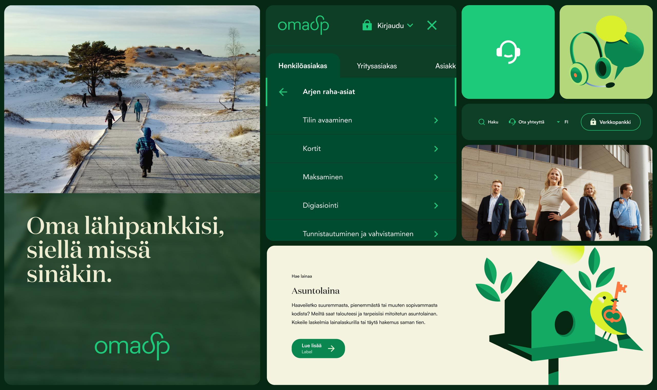
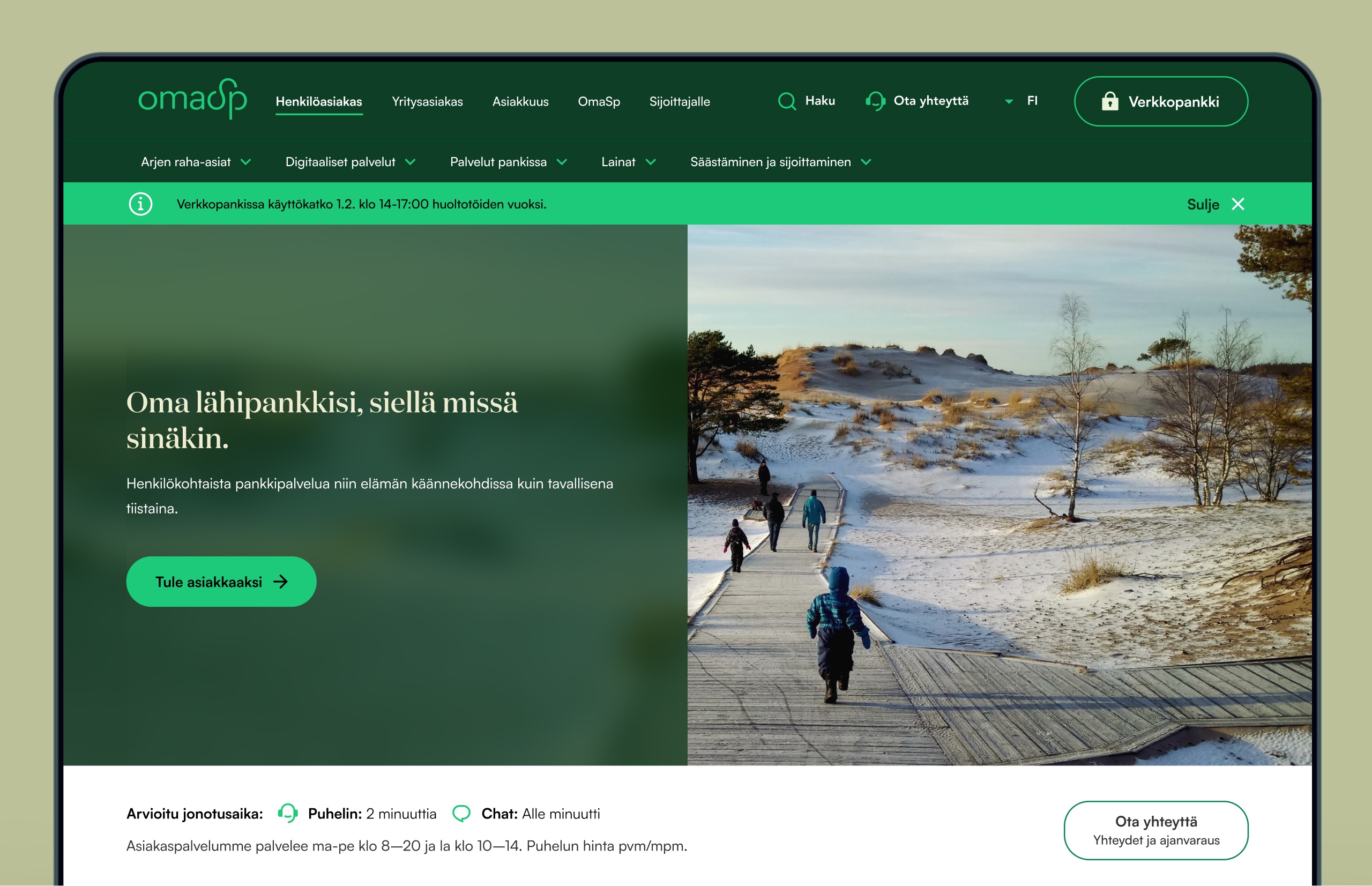
A natural yet distinctive colour palette and refined typography bring warmth, energy and character into the traditionally restrained world of banking, creating a recognisable foundation across every touchpoint.
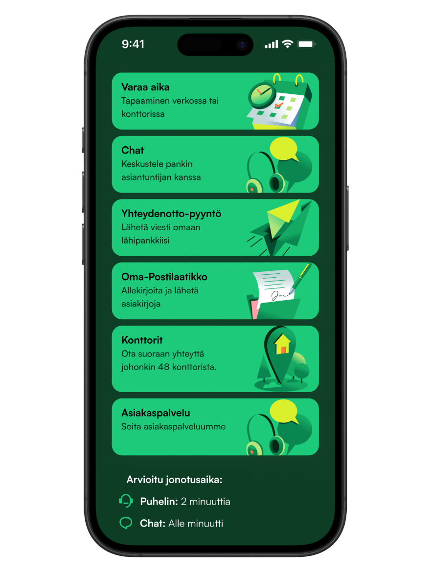
A new illustration style turns OmaSp’s products, services and everyday banking moments into familiar stories, inspired by real locations and the communities around each branch.
The photographic world builds on the same sense of place. Finnish landscapes and people across the country create a feeling of shared pride, while portraits of OmaSp’s own teams in local environments give the brand a genuine human face. An optimistic and approachable photographic style ties it all together, with consistent light, colour and subtle touches of OmaSp’s signature green.
The renewed identity gives OmaSp a warmer, more expressive and recognisable presence, while staying true to the heart of the brand. It brings OmaSp’s promise to life: a bank connected to the people and places it serves — your own local bank, wherever you are.



Results

“Working with Kuudes was a pleasure: highly rewarding, effective and inspiring. From the very beginning, they understood OmaSp’s identity, values and ambitions, and translated our renewed strategy into a refreshed brand and visual identity that feels confident, distinctive and true to who we are. The result beautifully strengthens our position as Finland’s most personal and accessible bank, while staying close to our local roots. We truly appreciate Kuudes’ strategic thinking, creative expertise and warm, professional way of working.”
– Pirjetta Soikkeli,
Executive Director of Communications
For more information:
Jari Danielsson
CEO, Kuudes Nordic
jari.danielsson@kuudes.com
+358 40 730 9612
Illustrations | Pietari Posti
Team images
Photographer | Jussi Hellsten
Producer | Hanna Kaikula
Landscape images
Photographers | Harri TarvainenMikko NikkinenEeva MäkinenMira Lähdekorpi



Business Enquiries

